BRAND GUIDELINES
Welcome to the Ecosoft brand Guidelines
First and foremost, the purpose of this document is to be a useful resource. You’ll find lots of information about the new Ecosoft brand identity — including messaging, logo, color scheme, typography, brand elements, and how to use them all in harmony.

Logo
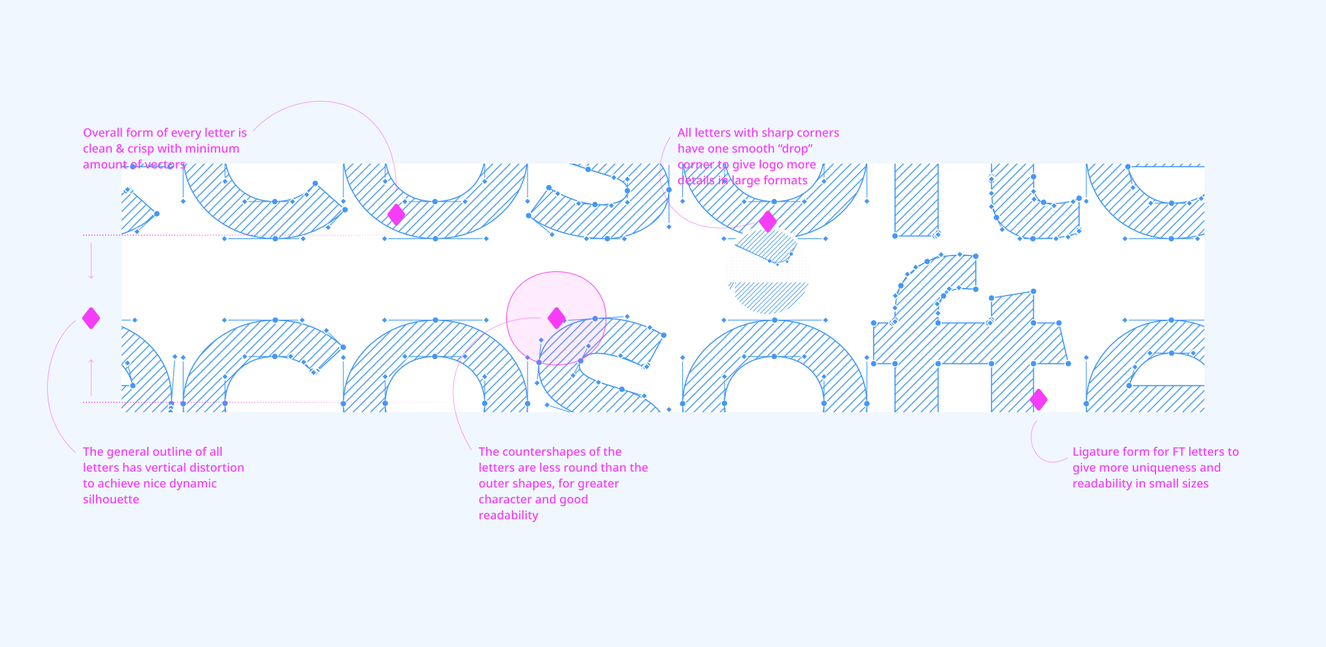
The Ecosoft logo is one of the most important components of our brand identity. It holds a lot of brand equity and recognition. The geometry within the letter forms is also the foundation of our entire visual system. The logo has been rebuilt in order to improve legibility, scalability, and consistency. Please use this page as resource and a guide when using the logo.
kerning
For a deeper understanding of logo construction, here are the rules of kerning. It is important to ensure that these rules are always correct when you are working with branding, logo scale, or performing various design tasks.
Primary Logo
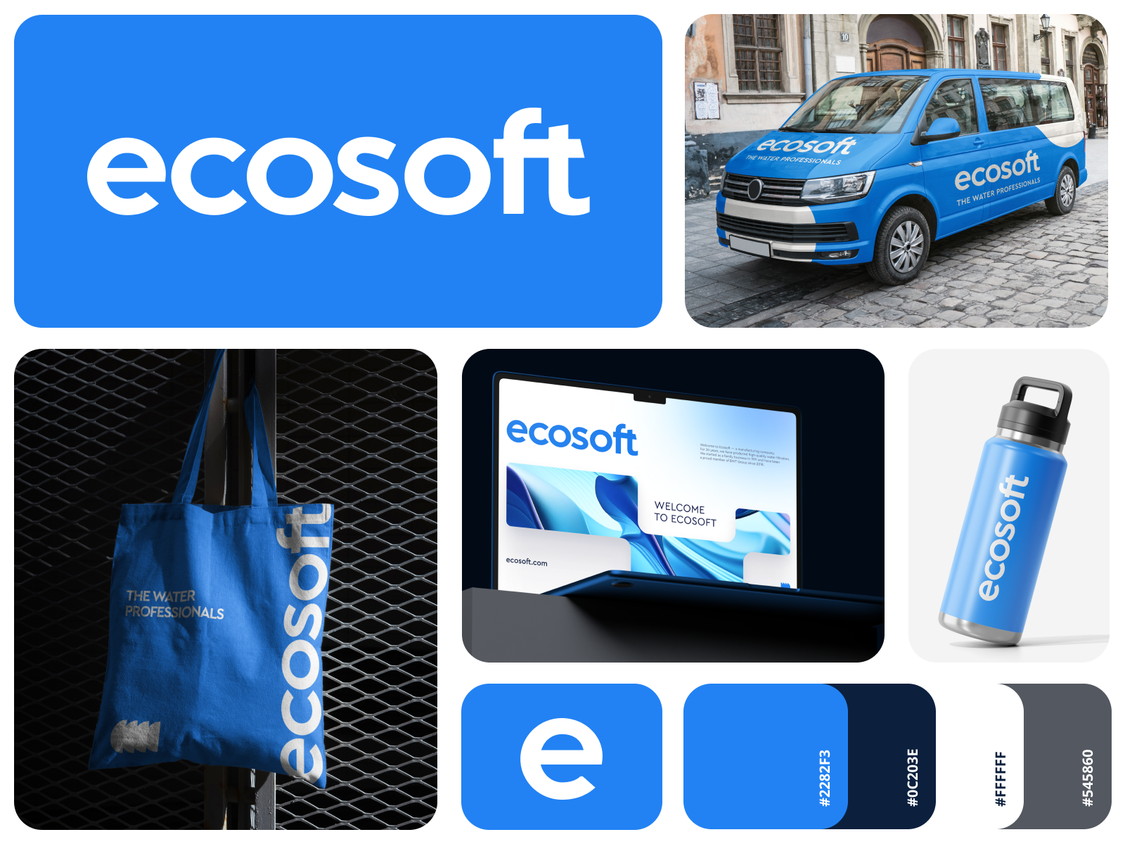
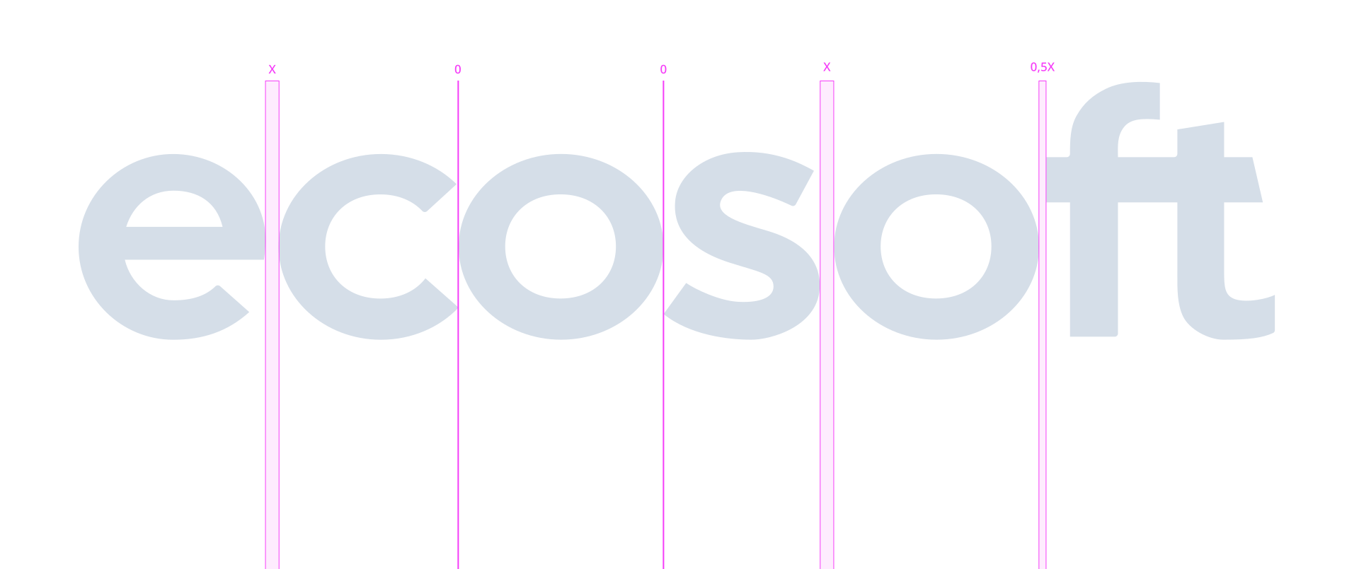
Our primary logo appears as blue on white or white on blue. Whenever possible, these color combinations should be used — particularly in cases where the logo will be seen frequently over time. Examples of this include social media icons, email signatures, and presentation cover pages. In certain communications and marketing materials additional colors can be used with the logo. Secondary color combinations can be found on the color page.
Scaling
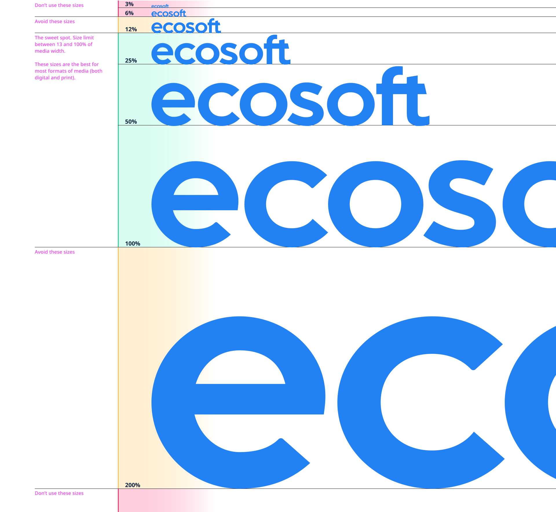
Always ensure the logo is legible and use your best judgement when scaling. If it becomes difficult to read, it may be too large or small. The logo has been constructed to ensure legibility at any scale, but there will always be a reasonable limit.
Try using this size guide to ensure your logo is clear, legible, and has good contrast.
To determine the optimal logo size for your marketing materials, compare the width of the media with the width of the sign.
We recommend using a sign size between 13% and 100% of the width of the advertising media. Any other use of the logo is highly discouraged and should be done with caution.
Whitespace
Do not crowd the logo. When placing the logo, use the size of letter O for minimal whitespace paddings around the logo. Pay attention to count vertical spacing from the overall logo layout and not from letter callouts.
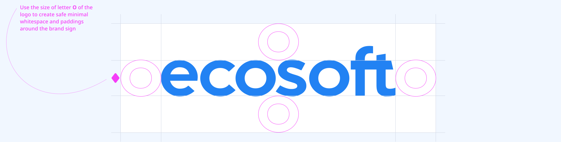
Whitespace
Monumental Logo Placement
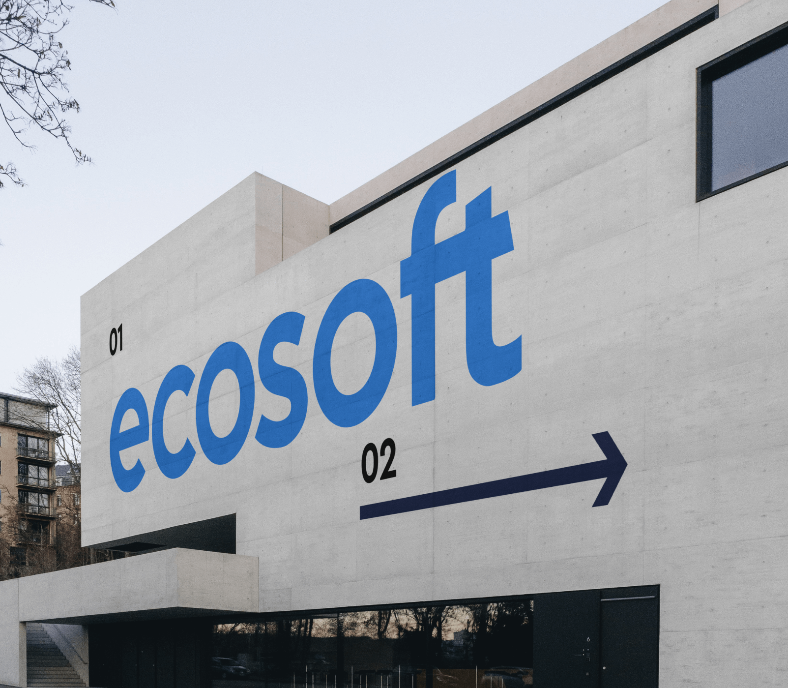
In specific cases, the logo can be used as a monumental design element, stretching either vertically or horizontally across the medium and becoming the centerpiece of the composition. This approach highlights the brand’s strength and creates a bold visual statement. When applying the logo in this way, it should be positioned close to the edge of the medium, while ensuring compliance with the indentation rules outlined above for the corresponding edges, depending on its placement.
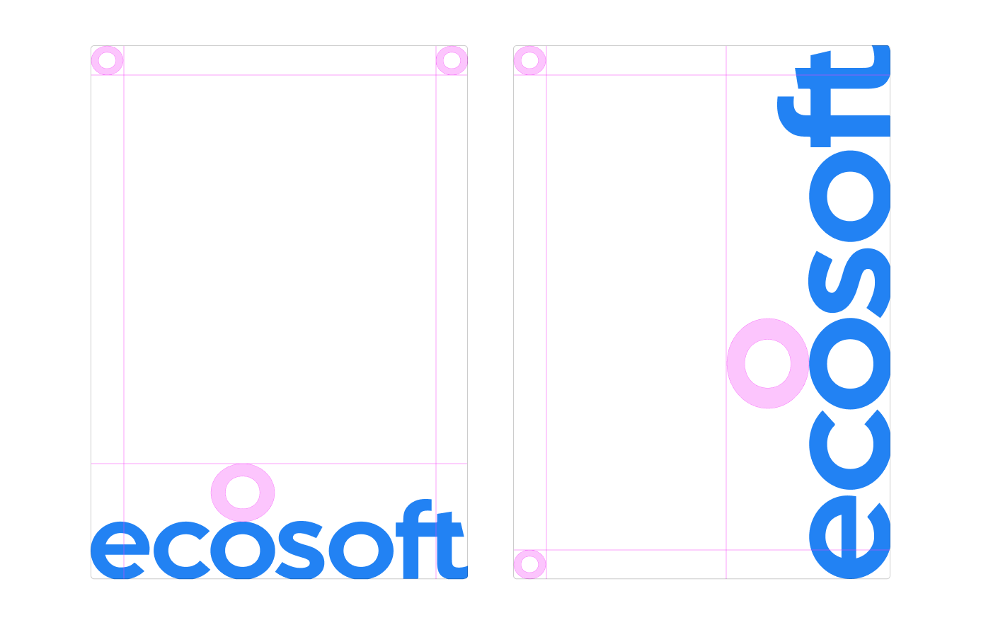

Lockup Construction
Please note that the secondary heading should be less bold than the main logo.
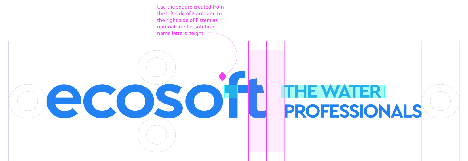
Lockup Construction vertical alignment
Please consider that length of sub-brand wording must be no wider than main logo then 20% (in cases with wider wording please use multiline wordings rather then singleline).
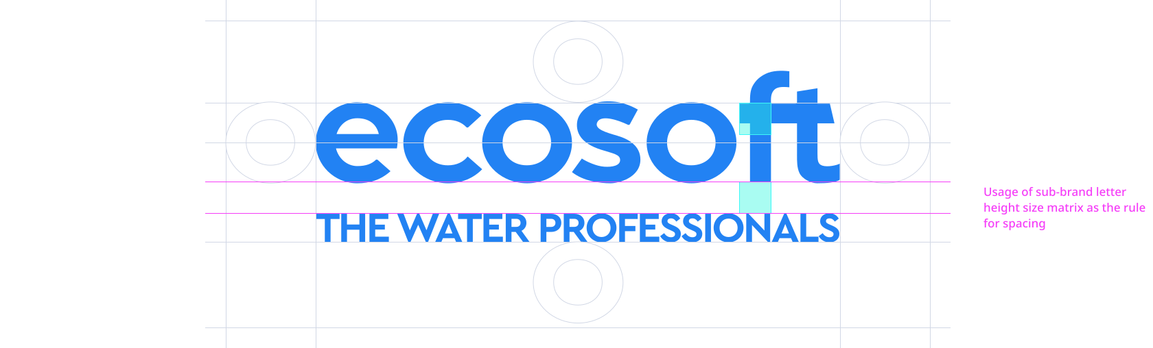
Correct usage
Download logo Pack





Color
Core Palette
Color plays a crucial role in our identity. With it, we establish our brands expression and personality. Navy Blue, Blue and White are the core part of our color palette. Together they help maintain brand consistency and combine for the ideal contrast.
Color Proportion
Color plays a significant part of the new Ecosoft brand. Use the guide below as a reference for how to achieve the ideal proportions of bright and neutral colors. It’s important that nothing ever looks too dark.
Expanded Palette
In extended brand use, the full palette can be used. There are three additional bright colors as well as muted, softer colors to accompany them. Some simple rules on color application are below, but more detailed examples can be found on the Brand Expression and Examples in Use pages.
Color recommendtion
The general recommendation for using a logo is maximum contrast of the sign regardless of the size it occupies. It is important to understand that the sign is the face of the brand and should not be allowed to visually merge with backgrounds or other texts in communication.
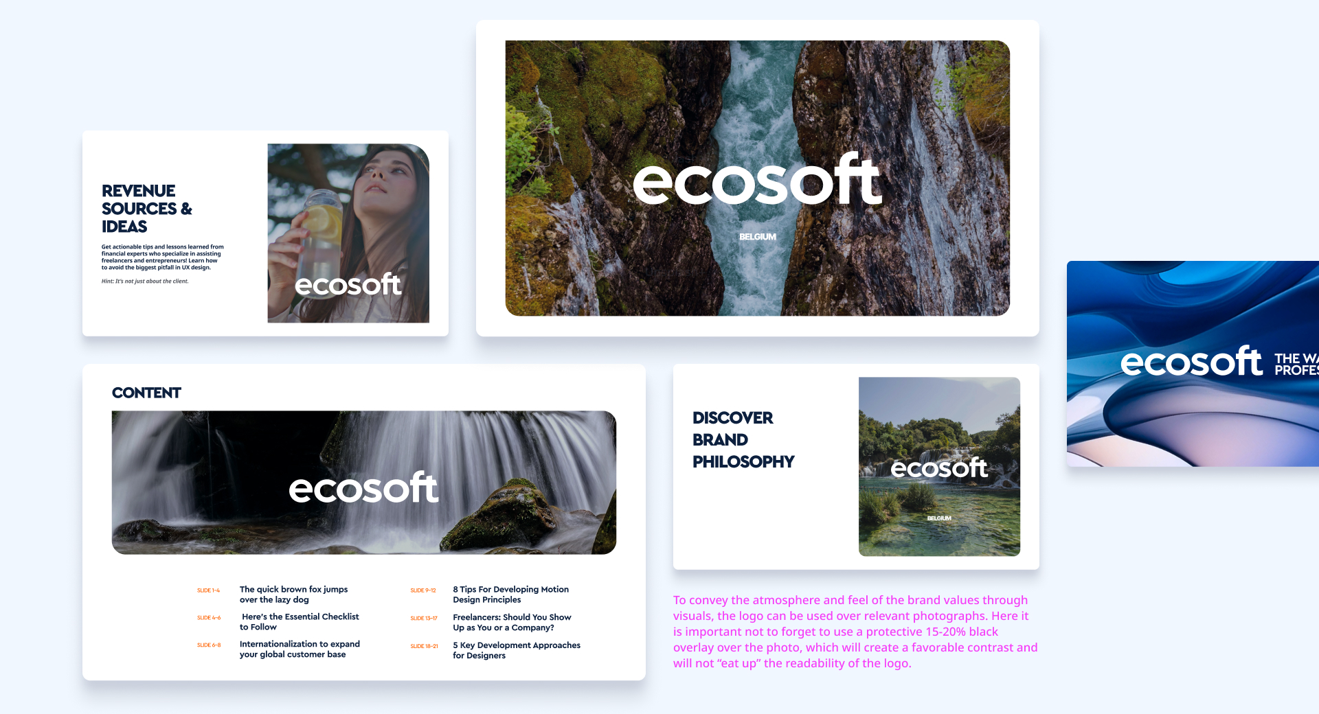
don'ts
Here are examples of cases everyone must avoid while working with brand identity and communiction. Remember that the brand logo must always be readable,have high contrast, include easy-to-read call-to-actions and secondary texts,and always use a recognizable visual brand style.















Typography
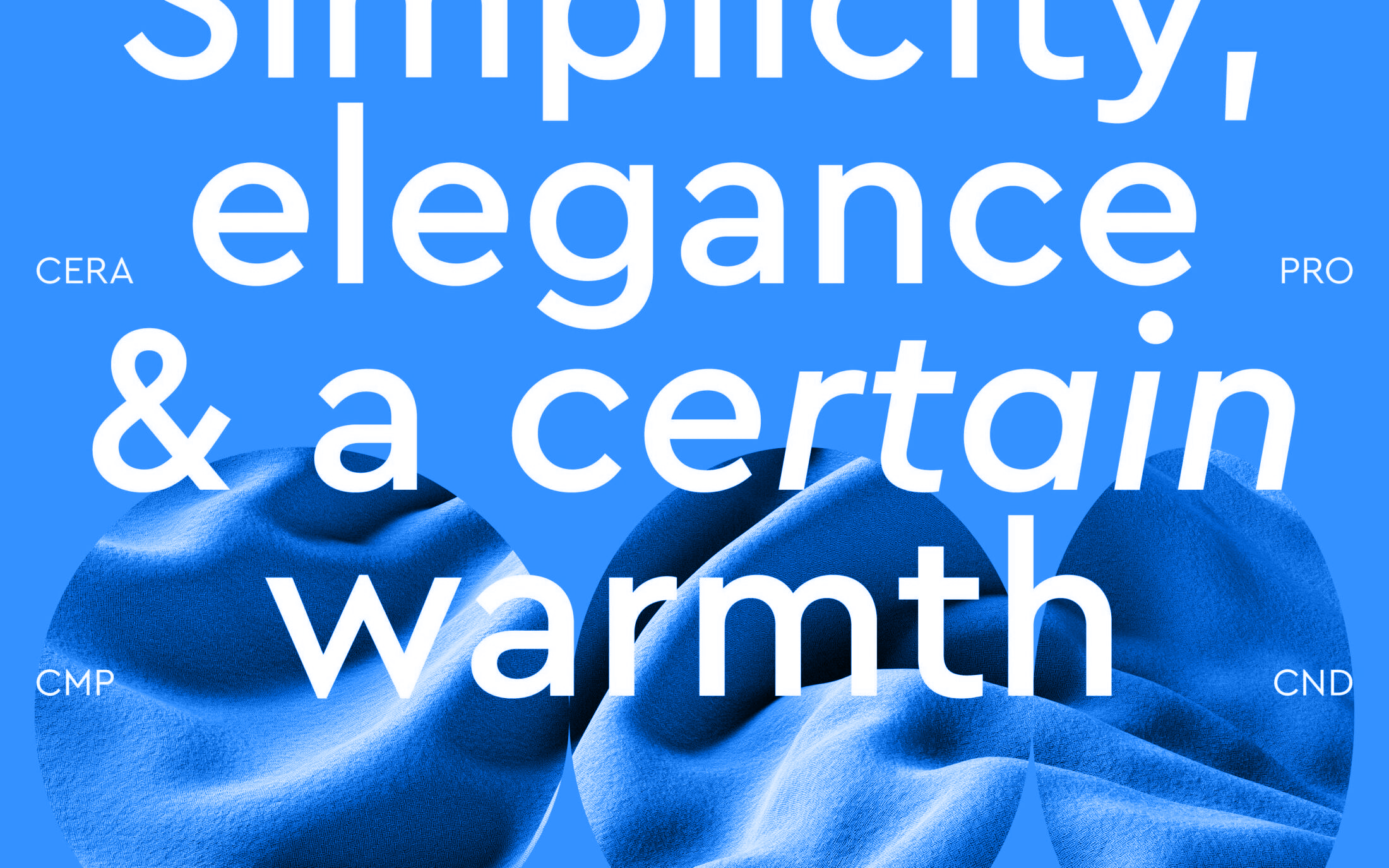
The key to Cera Pro is its usability. Whether responding to print, screen, technical commitments or aesthetic demands, Cera Pro remains super usable and ready to match your design vision. With a carefully controlled character for utility and clarity, this geometric Sans subtly combines a friendly attitude and classic details. Modernism and the luxury of Art Deco are joined with the solid performance of text typefaces.
Font Weights
Use the following as a guide for creating a type hierarchy within our brand.
Cera PRO, Bold, decreased letter spacing -2%
Big Headline Example
Cera PRO, Black, decreased letter spacing -6%
Bold HEadline Example
Cera PRO, Bold, decreased letter spacing -2%
The quick brown fox jumps over the lazy dog
Cera PRO, Medium, decreased letter spacing -6%
The quick brown fox jumps over the lazy dog
Noto Sans, SemiBold, 190% line height
Typi non habent claritatem insitam; est usus legentis in iis qui facit eorum claritatem. Investigationes demonstraverunt lectores legere me lius quod ii legunt saepius.
Noto Sans, Medium, 150% line height
Lorem ipsum dolor sit amet, consectetuer adipiscing elit, sed diam nonummy nibh euismod tincidunt ut laoreet dolore magna aliquam erat volutpat. Ut wisi enim ad minim veniam, quis nostrud exerci tation ullamcorper suscipit lobortis nisl ut aliquip ex ea commodo consequat.
Noto Sans, Medium, 150% line height
Lorem ipsum dolor sit amet, consectetuer adipiscing elit, sed diam nonummy nibh euismod tincidunt ut laoreet dolore magna aliquam erat volutpat. Ut wisi enim ad minim veniam, quis nostrud exerci tation ullamcorper suscipit lobortis nisl ut aliquip ex ea commodo consequat.
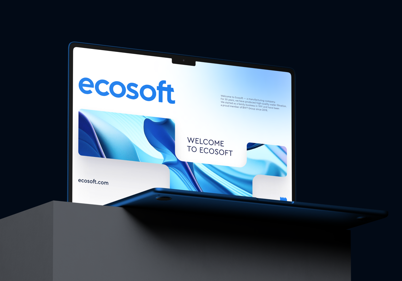
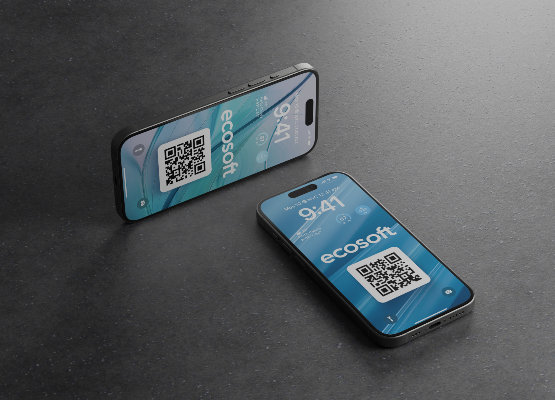
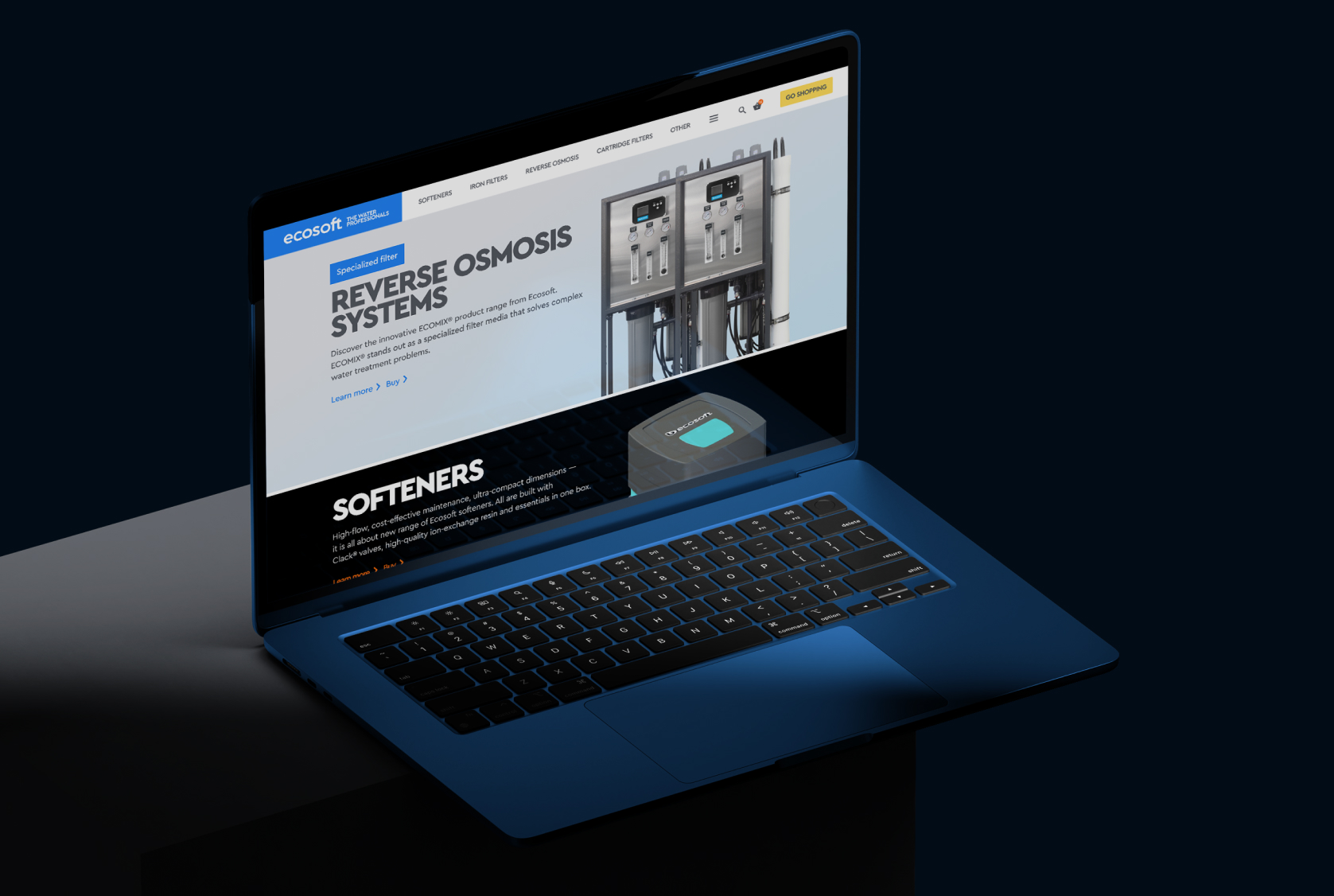
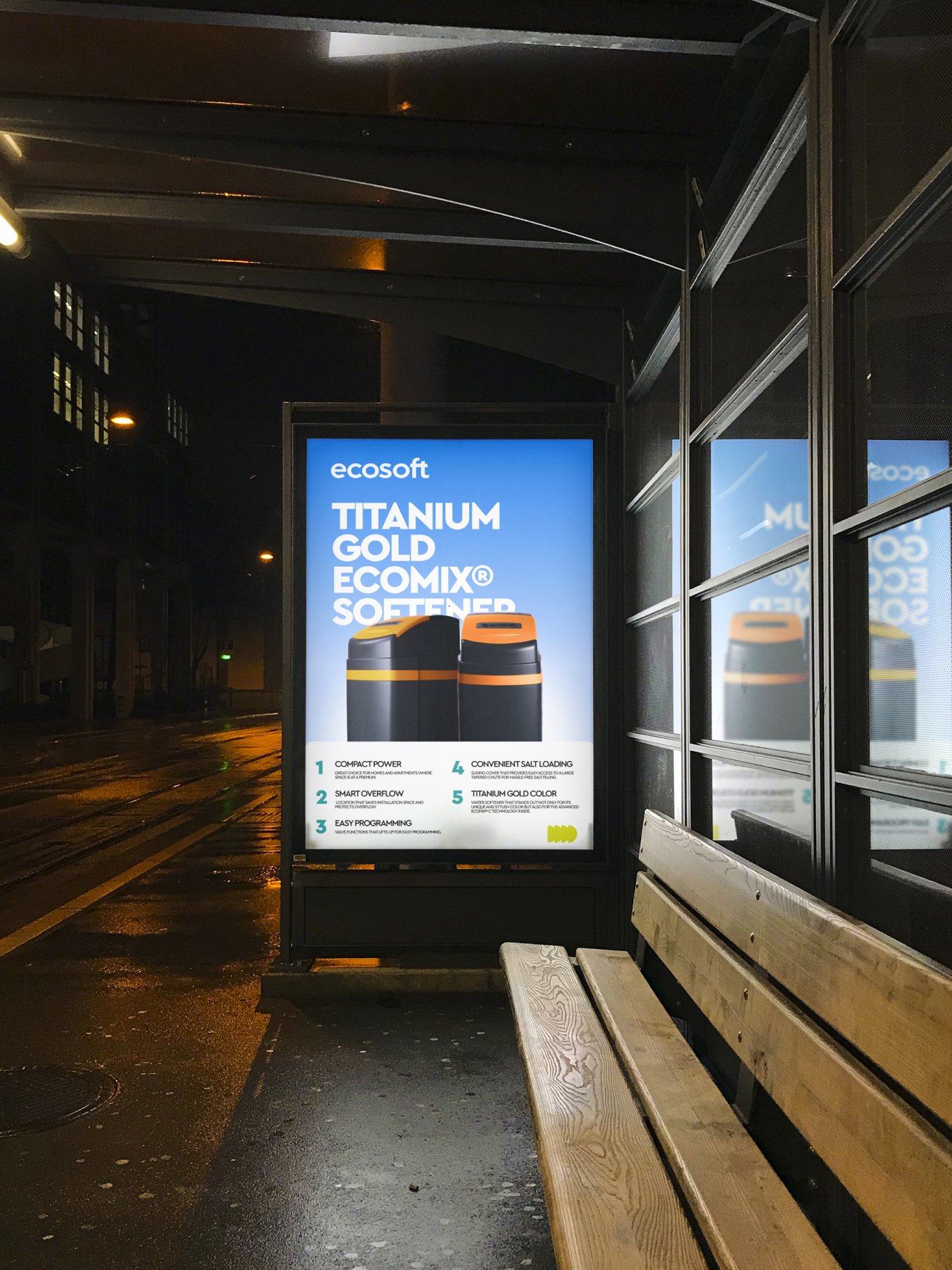
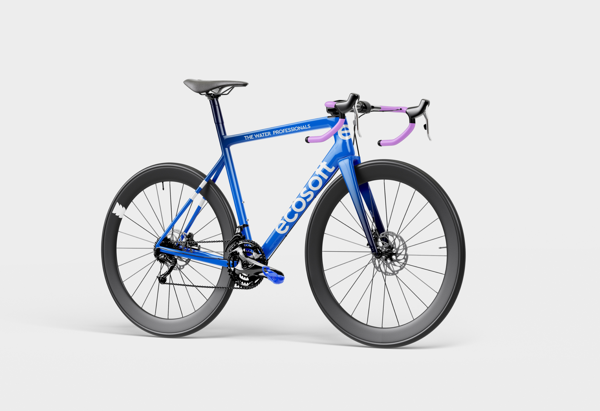
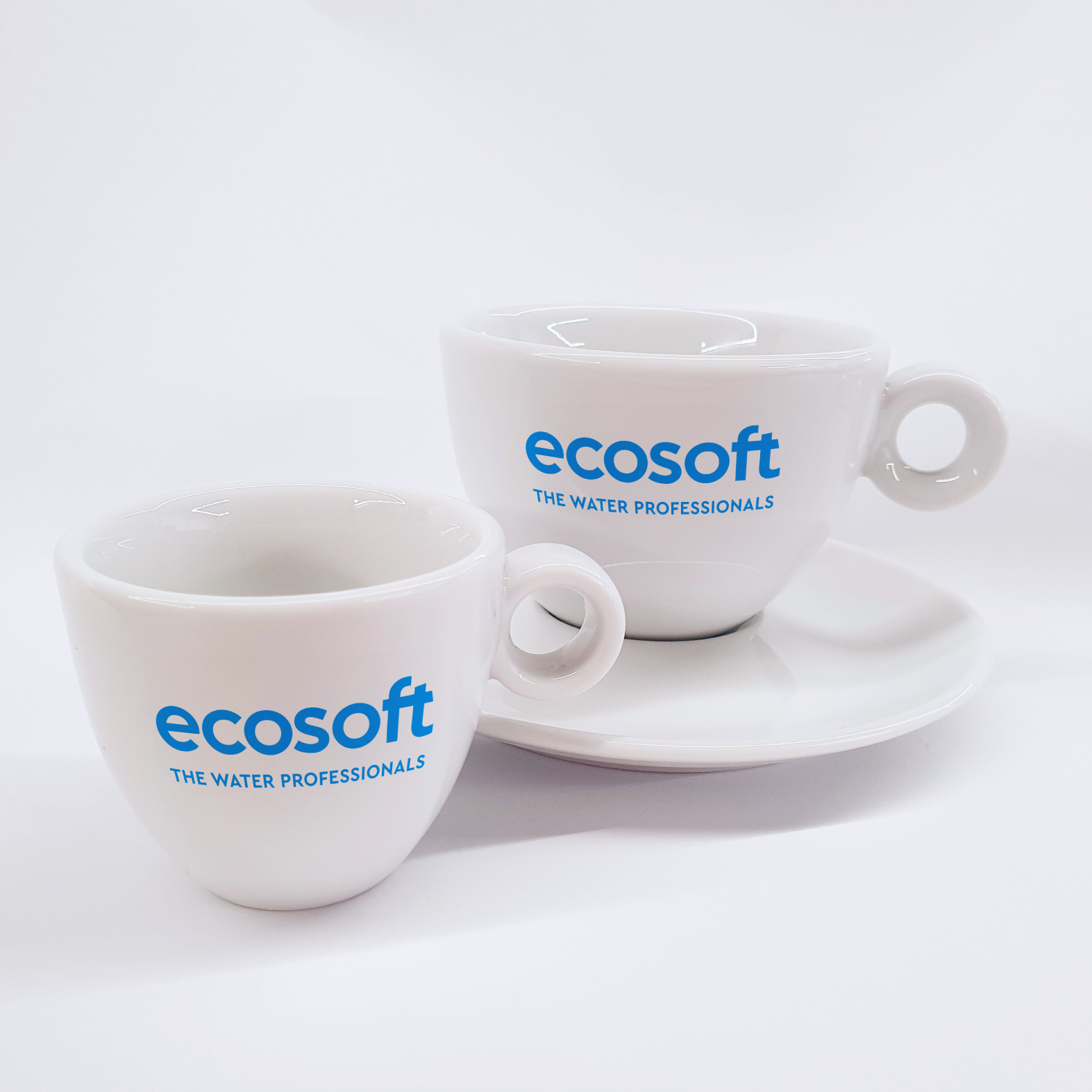
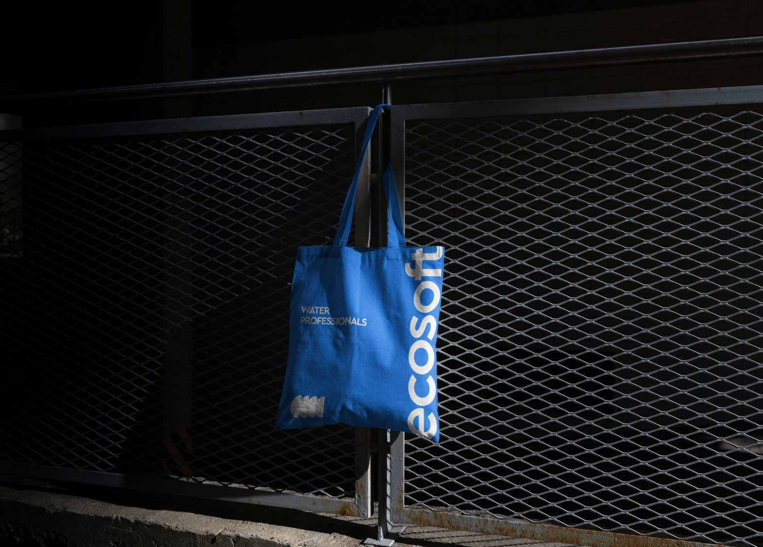
EXAMPLES IN USE
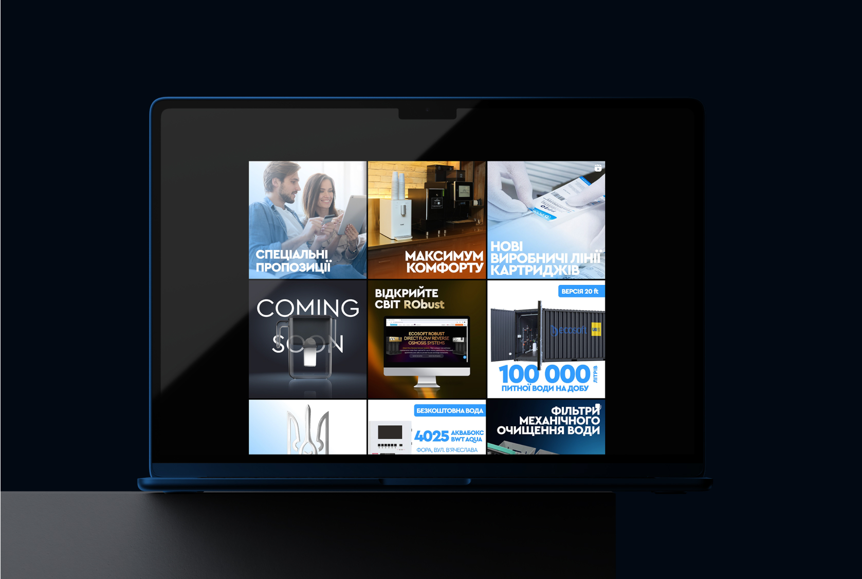
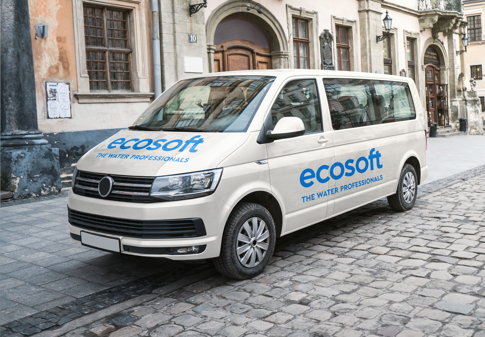
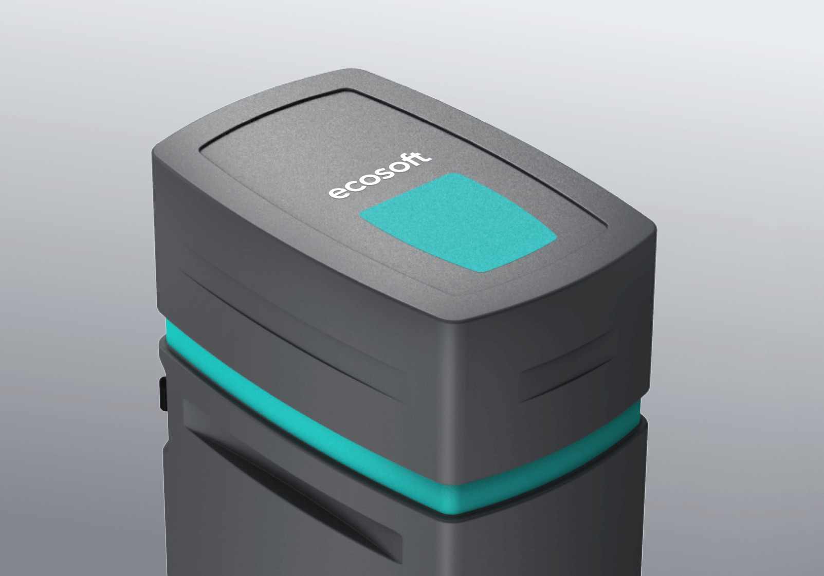
A good brand is a living, breathing ecosystem
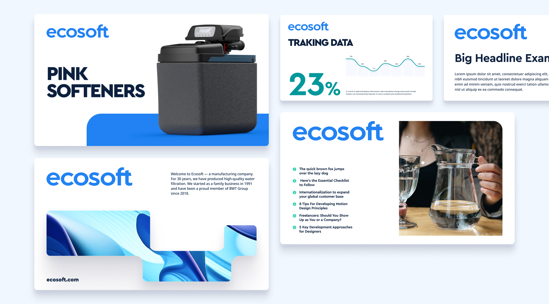
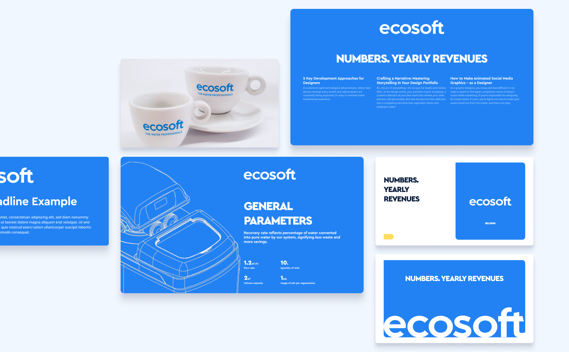
This page is continually updated with relevant examples of the brand as it lives in the world. It’s a great place to go for a gut check on something or inspiration when you’re stuck.